 Why Does Responsive Design Work So Well for Wine?
– You get a mobile app-like experience without having to download an app: full content and features of the site.
– So …. we’ve rebuilt the site from the ground up so that it instantly resizes to any smartphone, tablet or computer.
– The new responsive design doesn’t replace our mobile apps on iPhone and Android, it complements it on other smartphones.
– Responsive design also makes sharing content on social media far easier.
– The profound impact that both Twitter and Facebook have on the wine world is why we were early to the game on both platforms.
– Two years ago, I interviewed Paul Mabray about the wine industry and Digital Darwinism on video for the wine industry.
– Sometimes it just takes a while for the future to catch up with your crazy ideas ;)
What else is new on the site?
– The new homepage now refreshes content regularly highlighting what’s new rather than remaining static.
– Better use of white space and graphics: this isn’t just about pretty pictures; it’s about how we consume content online and making it easier for you.
– Completely new My Account section to optimize your experience on the site.
– The number of reviews on the site of 204,891 reflects the contributions of the most passionate and largest wine community in the country, in addition to my own reviews.
Got suggestions for new features? E-mail me at [email protected].
Why did we do this?
– Google estimates mobile search will exceed desktop and laptop searches combined by the end of 2014.
– Mobile is even more important in the wine category where most decisions are made in a liquor store or restaurant, not at home on a desktop.
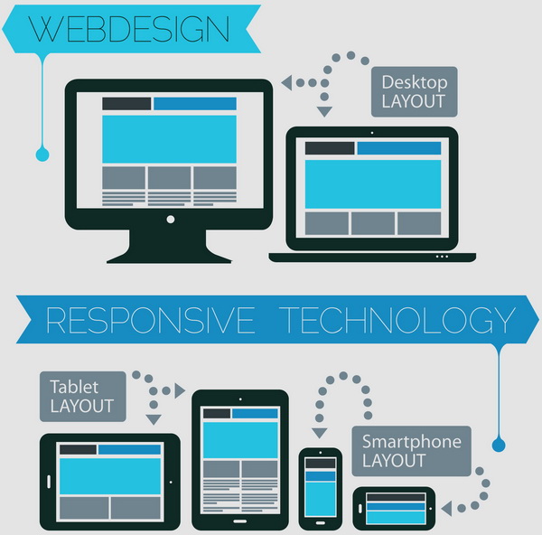
– Responsive web design gives web site visitors the optimal viewing experience.
– Google loves responsive design because it’s a far better user experience than rigid sites and so their rankings reflect that.
– We’ve always tried to lead the way in the wine category with new technology where it makes sense for our community.
– That’s why we’re the only wine review site to have native mobile apps on both iPhone and Android (which we’ll continue to update) with the complete inventory and stock updates for all three major liquor store chains in the country, with more to follow this fall.
How does the new site help you?
– Cutting-edge design that’s flexible, fluid and fast-loading for easy reading and navigation.
– Adapts layout instantly to the visitor’s device, sizing the text and graphics to fit the screen size exactly.
– Works on any device and brand: smartphones, tablets/iPads, e-readers, laptops, desktops … BlackBerry and Windows users rejoice!
– Try this experiment: open any browser on your laptop or desktop. Then drag the browser to get narrower or to widen and you’ll see the site adapt in real time to those dimensions.
– Minimizes the visitor’s need to resize, scroll and pan to consume content (no more mice type!)
 Why do this now?
– The technology landscape is constantly changing, with new devices launching every month.
– Rather than chase the latest version of a new smartphone or tablet, with an app created just for it, we’ve designed a site that works on all screen sizes now and in the future.
Why is Responsive Web Design better than a mobile site?
– A mobile site is just a set of static web pages that have been written for one small screen size and has the old school ‘m.’ in the URL.
– Making the mobile experience a second-class citizen with less content is extremely dated. Visitors expect (and deserve) a unified, content- and feature-rich experience that downloads quickly.
– However, even smartphones differ in their width and length these days. As well, various sized tablets get missed completely with a simple mobile site.
– Responsive design, however, means that the same content goes to each device but it’s bundled with special code that displays that content exactly for each different device.
– Responsive design is much more complicated and costly for the site owner than traditional mobile sites, and requires the front end code (HTML/CSS) of a site to be rebuilt from the ground up. However, it delivers the ultimate in speed, simplicity and usability for the visitor.
– Responsive design starts from the user experience and builds out from there with content and features, rather than starting from top down perspective of the site owner and pushing content down in a format without regard to the visitor’s device and experience.
– Responsive design is also better for branding: one site, one look, all devices.
– Responsive design is the best future-proofing we have available to us today. It also gives us the holy grail of Create Once, Publish Everywhere (COPE): one code base to rule them all and the best ROI for your web design investment.